
Looks do matter
Then:
Like most accounts software available in the market, V3 was not sexy or enticing. It did exactly what you wanted it to do, but with a complex and busy screen, there were quite a few subtle changes that would take ApprovalPlus to the next level.
Now:
The traditional way of managing Accounts Payable documents is over. Managing the Accounts Payable process on a computer is meant to reduce the amount of paper on your desk – not just replicate it on your desktop.
We’ve taken the time to reflect on how we actually work when technology isn’t in the picture, and redesigned the ApprovalPlus user Interface to work intuitively with how humans think and make decisions. A new, streamlined home page shows the user a summarised task list that displays the number of outstanding tasks, creating a more organic and efficient user experience.
Functionality in fine form
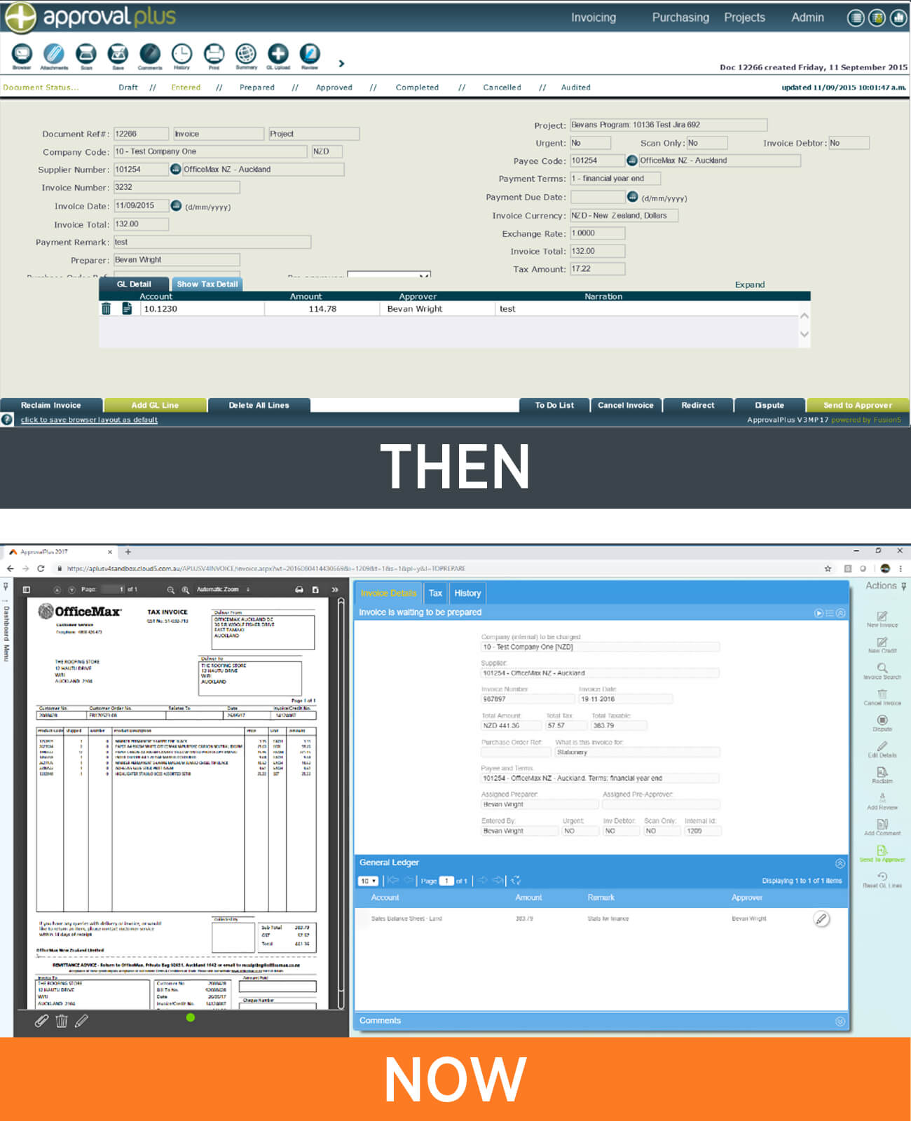
Then:
Travelling from menu button, to function buttons and action buttons in V3 would take you on a cross-monitor journey. While completely functional, we saw that ApprovalPlus had the opportunity for improvement by finding a way to cater to those who consume information visually, and that’s just what we did.
Now:
V4 continues the human-centric approach by enabling the user to customise the functionality of their ApprovalPlus experience. By pinning/unpinning menus, tabs to categorise information and the ability to expand/shrink sections within the screen, the user can use ApprovalPlus in a way that suits their way of operating. ApprovalPlus works for you – not the other way around!
The monumental change between V3 and V4 is the visual panel that will display the associated document or report that corresponds with the screen the user is working on, whether it’s the image of an invoice or purchase order, or a report on the data being reviewed. A visual element provides a new channel for the user to process the information, and we’ve tried to incorporate this throughout the application.
Crystal clear consistency

Then:
Data entry in V3 fulfilled its purpose. A no frills approach, V3 got the job done, but there was room for improvement to make the whole Accounts Payable process feel seamless and consistent.
Now:
When doing data entry, users like clarity. Can’t “Pass Go” without a populated field? Then ApprovalPlus will let you know before you proceed to the next step, and won’t make the “Save” button functional until it’s filled. Those annoying “You have forgotten to select a Valid Business Unit” messages are a thing of the past.
Following the theme of working towards an Accounts Payable application that helps cater to those who consume their information visually, the modules throughout ApprovalPlus are now uniform. It’s the little things that make the difference. You can now have company branding on the landing page, a straight-forward way to change your password and the ability to access ApprovalPlus from your laptop, tablet or iPad without having to VPN into the company network.
New customers can join now, and existing customers have the ability to move across now for those with the invoice and purchasing modules, end of March the expenses and cards modules and later in the year for projects users. Both on-premise or cloud SaaS offerings are available, bringing not only a new system, but also a new way of supporting our customers.
If you would like a demonstration of ApprovalPlus V4 and a discussion around how it can work for your organisation, please contact our ApprovalPlus guru Bevan Wright.
